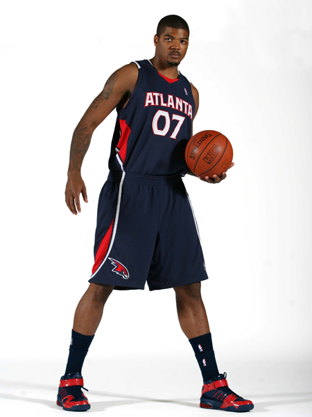
Links: New Hawks Uniforms
About two months ago I got my hands on one of the Hawks Draft hats for the upcoming draft. Not a big deal, except the hat featured the new Hawks logo, which hadn’t been announced yet.
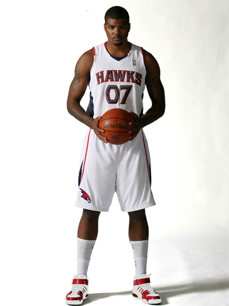
I’ve patiently held my tongue all this time, but they finally publicly announce the new logo and uniforms tomorrow. Photos below. I like them…kinda like the BETcats, but without that odd orange color. Also, first time since I’ve been alive that the Hawks didn’t have red and yellow in their team colors. Hawks fans no longer have to dress like they work at McDonalds!